NativeScript is a cross-platform mobile applications development platform using JavaScript, TypeScript or Angular. Telerik – a Progress Company (NASDAQ: PRGS), created NativeScript. NativeScript is a different technology - it is a runtime, not a web technology.
To try out this blog post, basic understanding of JavaScript, CSS, Terminal usage and any text editor knowledge will be helpful.
To begin with, we need to have NativeScript installed on the workstation to start coding. Download link to NativeScript is shared below:
NativeScript - http://docs.nativescript.org/angular/tutorial/ng-chapter-1#11-install-nativescript-and-configure-your-environment
NativeScript supports various layouts:
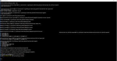
The example is this blog post explains usage of GridLayout. To start coding navigate to the terminal or command prompt. We first run the command "tns --version" to check NativeScript installation.
If you can see version of NativeScript, we can proceed to creating our demo project. To create a new project we execute command "tns create *project-name* --ng". Please refer below screen-shot for more information on success of project creation.
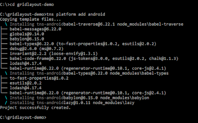
Once the project is created, navigate to the project folder with change directory command. We need to add platform based on the device we need to test the demo project on. The command to add platform is "tnd platform add android"
After adding the platform we are all set to add GridLayout for our UI in the demo application. Let us take a look at the project folder structure. By default when a new project is created with NativeScript CLI, it has a basic template with "Tap the button" functionality.
The most important folder on which we will focus now is 'app' folder. This folder contains source code of the application including all the classes, html and css. To make the demo for GridLayout, we will navigate to this folder and modify the 'app.component.html' file. Before making any changes, lets run the project once and see the output. The command for running the project is "tns run android --emulator". If android phone is connected to the development pc in debug mode then command used will be "tns run android" or "tns run android --watch". Please refer below screen shot for output.
GridLayout defines grid for the available screen area on the device. In this example, we will create 3x3 grid which means, three rows and three columns. We will try to place one icon in absolute center of the device screen. To be more precise, we will place one icon in grid (1,1). The grid system considers first row and column to be zero, so (1,1) refers to first row, first column.
Consider the code below for initializing the GridLayout.
<GridLayout columns="*, auto, *" rows="*, auto, *">

</GridLayout>
The columns attribute in the code signifies three columns as "*, auto, *". 'auto' occupies the height as much as the content is placed in this grid. "*" signifies all the remaining area will be used. As in code above we have two "*" and one "auto". So the content height will be used by "auto" and the remaining area will be used by other two "*" columns. Similarity the rows attribute has "*, auto, *" so content width will be used by middle row and remaining two rows will use the remaining area excluded by the "auto" row.
The final code for GridLayout will look something like below:
<GridLayout columns="*, auto, *" rows="*, auto, *">

    <Label text="Label 1" row="0" col="0" backgroundColor="white"></Label>
    <Label text="Label 2" row="0" col="1" backgroundColor="green"></Label>
    <Label text="Label 3" row="0" col="2" backgroundColor="white"></Label>

    <Label text="Label 4" row="1" col="0" backgroundColor="blue"></Label>
    <Label text="Label 5" row="1" col="1" backgroundColor="orange"></Label>
    <Label text="Label 6" row="1" col="2" backgroundColor="blue"></Label>

    <Label text="Label 7" row="2" col="0" backgroundColor="pink"></Label>
    <Label text="Label 8" row="2" col="1" backgroundColor="purple"></Label>
    <Label text="Label 9" row="2" col="2" backgroundColor="pink"></Label>

</GridLayout>
When we run the above code, it rendered like below screen on emulator.
Now we have a 3x3 GridLayout. As shown in picture above "Label5" refers to the center of the device which is row-1 and column-1. We will target this grid to add one image or icon. Let us change this grid content as below:
<Image src=" https://image.flaticon.com/teams/1-freepik.jpg" row="1" col="1" stretch="none"></Image>
After adding image to grid of row-1 and column-1, our output changes as shown in screen-shot from emulator:
As shown above, the "auto" property helps in expanding the grid to contain the graphic and remaining grid use the rest available area as denoted by "*" property of rows and columns.
The complete working example can be seen in video below:
Download completed project file - Click here
-Nitin


No comments:
Post a Comment